Release 11’s New User Interface – A Cleaner, Simpler, and More Powerful Experience
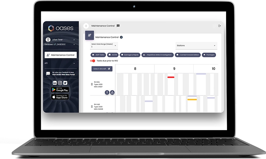
The way users interact with software has a significant impact on their productivity. It can also impact their level of satisfaction with the product. That’s why, with Release 11, we redesigned the platform with a new User Interface (UI). This new UI is cleaner and more in tune with how our customers interact with the product – all while preserving the ways of working that customers are used to.

What is UI and Why Does It Matter?
Before diving into the specifics of our new design, let’s clarify some key terms:
User Interface (UI)
Everything you interact with when using a piece of software – the screens, buttons, icons, and layout. In short, it’s how the software looks.
User Experience (UX)
The overall experience a user has when interacting with the software. It’s about ensuring the system is easy to use, intuitive, and enjoyable.
A well-designed UI directly impacts UX, and when done right, it can lead to smoother workflows, fewer frustrations and better business outcomes. Conversely, if the UI is poorly designed, users may struggle to find what they need, leading to lost time, errors, and frustration.
What Impact Can A Poor UI Have?
A poorly executed user interface can negatively affect user satisfaction and productivity. For example:
Complexity
Overly complicated menus and too many options can overwhelm users, making even simple tasks feel burdensome.
Inconsistency
If the colours, fonts, icons or branding are inconsistent it creates confusion and a lack of trust in the system.
Difficult Navigation
Users may struggle to find what they need, which can lead to decreased efficiency and mistakes in critical workflows.
What’s changed in Release 11’s New User Interface?
In Release 11, we’ve made several key improvements to the user interface to ensure it better supports your operations and enhances your overall experience. Here’s what you can expect:
Cleaner, Minimal Design
The new UI reduces visual clutter and allowing users to focus on what matters most – the task at hand.
Simplified Layout
We’ve reorganised the layout to feature fewer sections and categories, making it easier to access the tools and features you use every day without unnecessary complexity.
New Landing Page with BI
The landing page now includes a powerful snapshot of your data through our integrated business intelligence suite, OASES Insights. Even if you’re not logging in to analyse data, you might notice trends, anomalies, or operational alerts at-a-glance, helping you stay on top of critical information.
New Colours, Icons, and Branding
The interface now features a refreshed colour palette, updated icons, and our latest company branding and logos, providing a more cohesive and visually appealing experience throughout.
More on OASES Web
More of the system’s features are now available through OASES web, meaning greater accessibility on our most up-to-date user interface.

New User Interface, Familiar Workspace
While it was important to improve the look and feel of OASES, we also wanted to be mindful of preserving the core processes and workflows you already know. So, if you upgrade from Release 10 or earlier, there’s no steep learning curve. You can continue working as you always have, with the added benefit of a cleaner and more intuitive UI. As part of this focus, we’ve also retained Option Codes so if you know the option you need, you can just type in the number to get right to what you’re looking for.
For now – there’s still an option to switch back to the previous interface, while you get used to the new design. We don’t expect many customers will need this option, as it really is much easier to get around using the new OASES Navigator. However, we want everyone to be comfortable, so this toggle should help with the transition.

Charlie McFarlane, Head of Marketing and Engagement, commented on the new UI, “As someone who is passionate about design, it’s great to see this new look come to OASES. The changes are subtle, as we didn’t want our customers to feel lost in the new user interface, but they do make the system feel a little lighter and easier to navigate.”
“What I especially like,” Charlie added, “is how the interface puts our new business intelligence tool, OASES Insights, front-and-centre when the user logs in, so they can see their organisational data, at-a-glance.”
Improvements Coming in 2025
With Release 12 set to launch in 2025, you can expect even more enhancements focused on improving usability and functionality. We’re committed to making your experience as seamless as possible, and we’re excited about what’s ahead.

In the meantime, we hope you enjoy the improved user interface in Release 11. We believe these updates will help make your daily tasks faster and more intuitive. If you have any feedback or need assistance with the new interface, our team is here to help.
New to OASES? Why not get in touch below for a demo of the new user interface?


